
Like everyone else, coronavirus has been disruptive in ways I’d never seriously imagined. And yet, having lived for the past few years in a remote corner of Silicon Valley, life is not quite so different than my norm. I’ve always socialized primarily through virtual means, so my dance card has been largely unaffected. I was already getting groceries delivered as the norm, just to cope with the rigors of raising two young boys.
But I recognize the mathematical scale, the near inevitability of a pandemic, once mature, of what’s about to wash over us all. I’ve been spending some time using my data prep and data visualization skillsets to produce some rough ideas of what’s going on in our nation.
Of course, I used Alteryx to wrangle all my data together. You can download (but not run, as it does use the download tool) the workflow here.
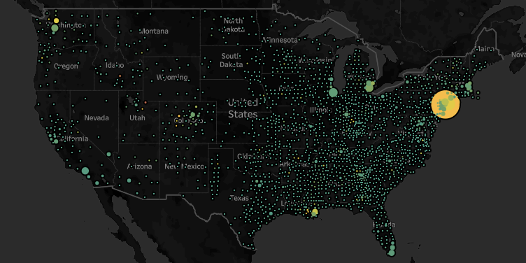
In this case, I used the NY Times dataset that provides county level caseloads. I used the Alteryx Business Insights data package to provide county and state level populations. I used an internally shared hospital beds dataset as well as a kss.org dataset on beds per capita. The former provided county level detail while the latter was strictly state level. If nothing else, they validate that the aggregate hospital beds nationwide is roughly between 800k and 1M. Again, I’m strictly looking for directional indicators, so even if I’m off by 20%, that’s ok for my purposes.
https://public.tableau.com/profile/josephschafer#!/vizhome/TimesC19Exploration/CountyCasesBeds
Truth be told, I’m rehashing a thesis that I tested back in 2014, when I was a candidate for a Sales Operations job working for Michael Mixon at Seagate. An ebola outbreak was ravaging West Africa and I made a prediction that while Sierra Leone at the time had the fewest total cases, their healthcare capacity was already maxed out, and thus forecast that they were most in need of assistance and triage. As my candidacy progressed, Sierra Leone took the lead in cases and consequent deaths and my thesis proved broadly correct. The world started seeing cases pop up outside of its origins, the US, among others, rallied to the cause, and we managed to avoid the worst case scenarios.
Early February this was on my radar, but it did seem like we had a chance to get ahead of this. Obviously that didn’t happen, and by late February I saw this likely to be an issue as China’s numbers came out started looking looking a little cleaner than one should expect - they still do, frankly, but that’s another story…
At any rate, what I see are some very intense caseloads relative to healthcare capacity in particular patches. I use either hospital beds or hospital beds per capita, (depending on the granularity of the data) and arrive at a rough approximation of a supply/demand analysis.
All the headlines out of NYC tend to validate the conclusion that as cases tread even close to the count of beds, the healthcare system is overburdened and more bad news will follow. And strikingly, Summit County, UT, which is currently the upper bounds for the cases/beds metric, is indeed suffering.
If you’re a data geek like me, check it out on Tableau Public. Reach out at Joseph.Schafer@Alteryx.com with questions, ideas, etc.